Stand design

Pipistrel, founded in 1989 by Ivo Boscarol, is a Slovenian light aircraft manufacturer based in Ajdovščina. Its facilities are located in Ajdovščina, Slovenia, and near Gorizia, Italy. Initially specialising in the production of motor-driven hang gliders designed by Boscarol, it expanded its range in the mid-1990s to the production of ultralight aircraft similar to full-size aeroplanes, with the Sinus being one of the first models mass-produced from composite materials. In 2022, the company was acquired by Textron.
MBVision in Pipistrel
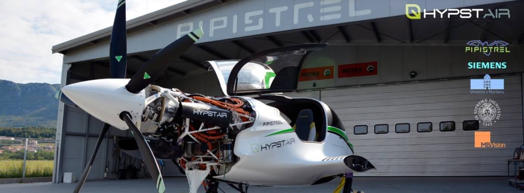
MBVision’s role in Pipistrel has taken on many facets, from livery design to corporate branding. MBVision, together with Pipiscrel, worked on EU-funded projects, and at Pipistrel the brand communication work took on a crucial role for the company, which gained momentum in the aviation sector until Textron concluded an agreement in March 2022 to purchase Pipistrel and form a new division for the development of electric aircraft, called Textron eAviation.
Branding Pipistrel
The design
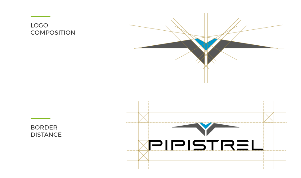
To create the Pipistrel logo, geometric grids were developed to guide the creation of a precise and distinctive brand image. This approach allowed the contours of the logo to be clearly defined, using two main colours to emphasise the brand identity. In addition, the font used in the logo was carefully selected and modelled to integrate perfectly with the geometry of the logo itself, creating a fluid and harmonious visual dialogue between the two elements. This process helped to consolidate Pipistrel’s visual identity, ensuring consistency and brand recognition.
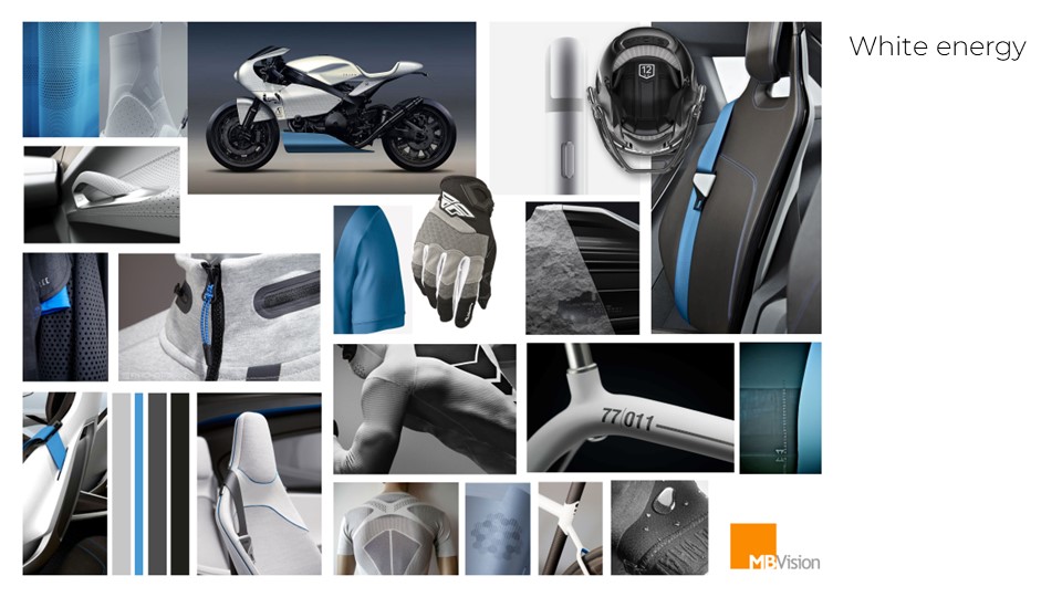
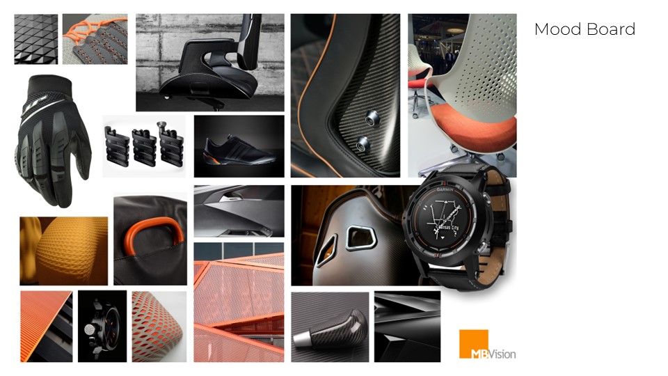

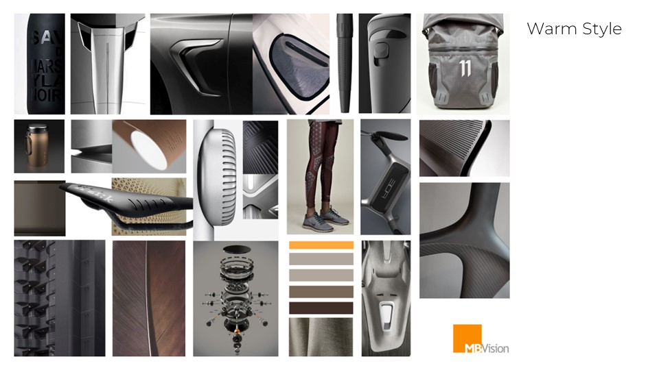
For the selection and definition of colours, a meticulous approach was taken that involved the creation of moodboards specifically designed to capture and represent the essence of the company’s image and communication. These moodboards not only provided a visual overview of the tones and shades best suited to the corporate context, but also helped define a consistent and meaningful colour vocabulary. This process allowed the distinctive attributes and visual identity of the brand to be effectively conveyed through a careful choice of colours.
colour variants
BRANDING
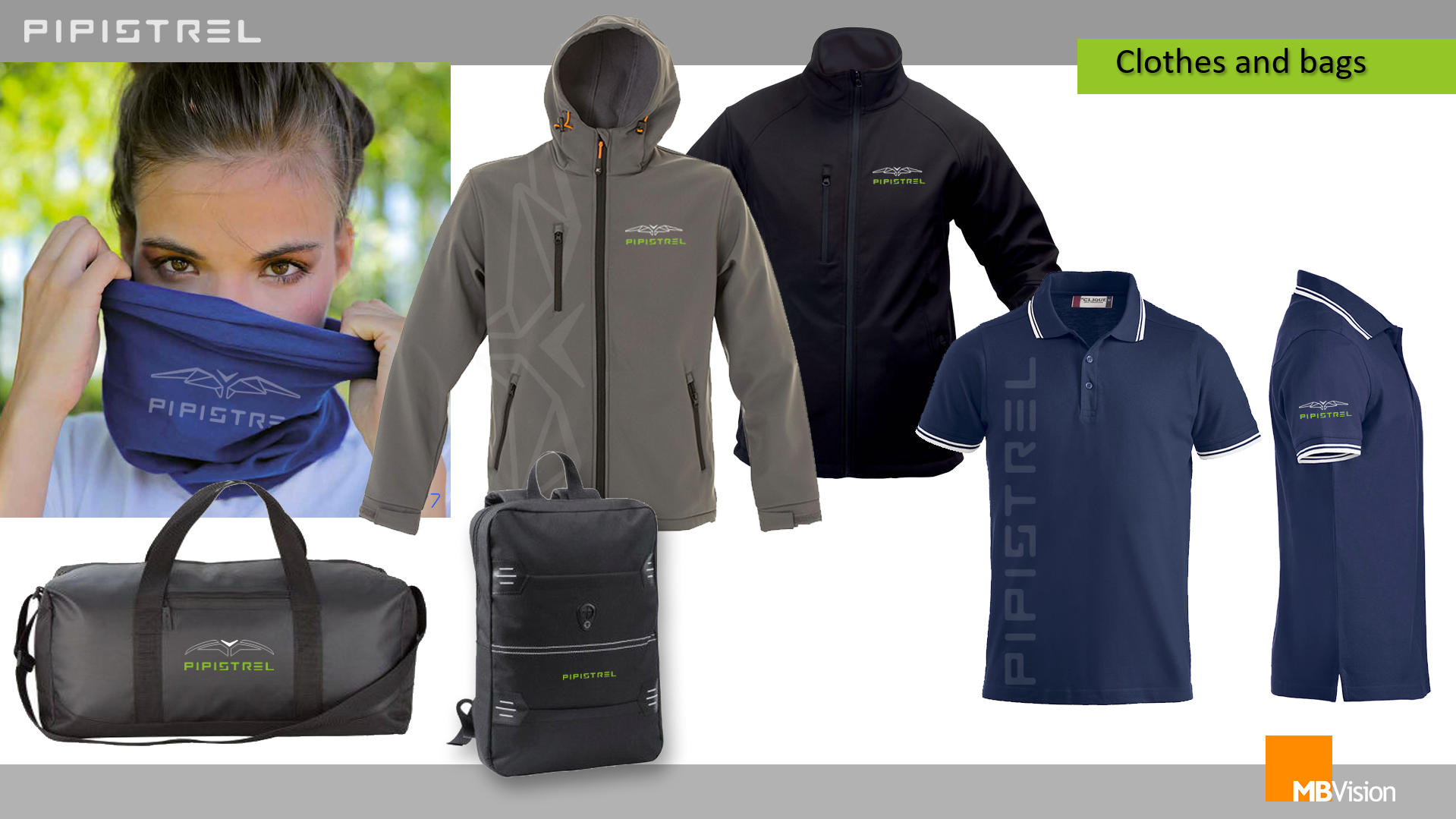
A comprehensive approach to the creation of the corporate image was developed, involving the creation and processing of coordinated images and the in-depth study of branding.
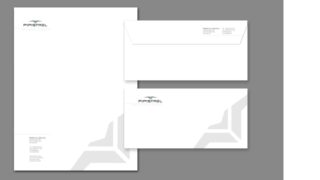
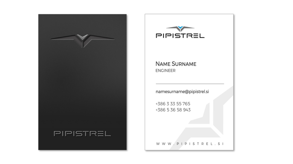
The main objective was to establish a visual and conceptual coherence that would unify the dialogue between the company and its communication. This process aimed to define a well-defined coordinated image that not only reflected the company’s identity and values, but also clearly and effectively conveyed the desired message.
stand design
aero friedrichshafen
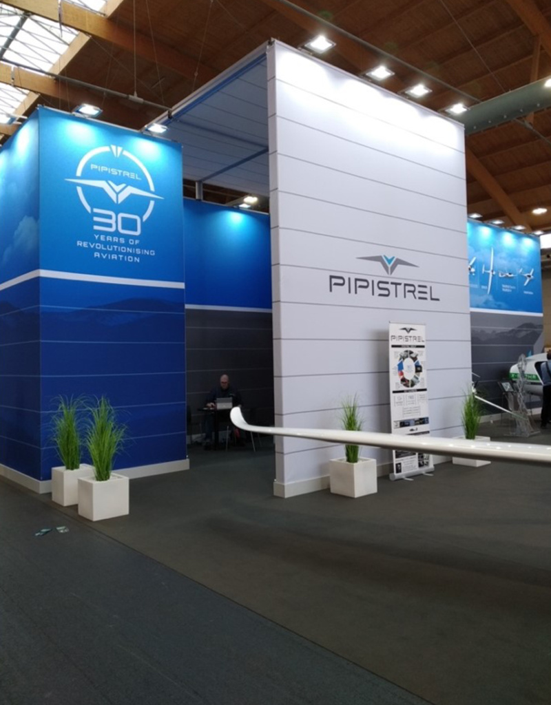
AERO Friedrichshafen is an annual trade fair dedicated to European general aviation. In this, the communication and presentation of a company plays a key role.
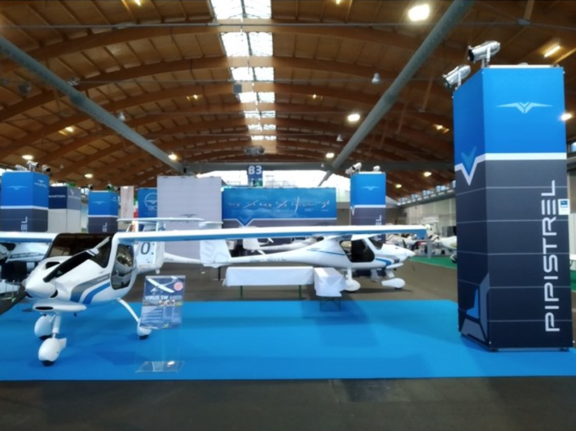
The stand
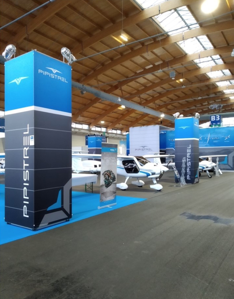
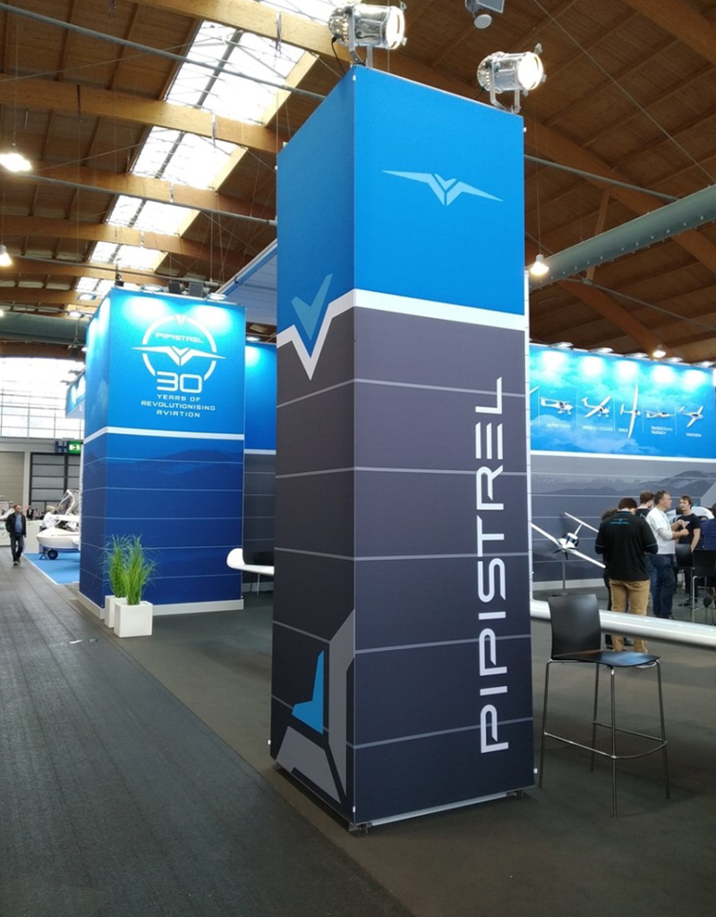
Starting from the analysis of the brand and what the company’s tone and communication was, MBVision created a stand by creating graphic content, designing and coordinating the available space.
COMMUNICATION
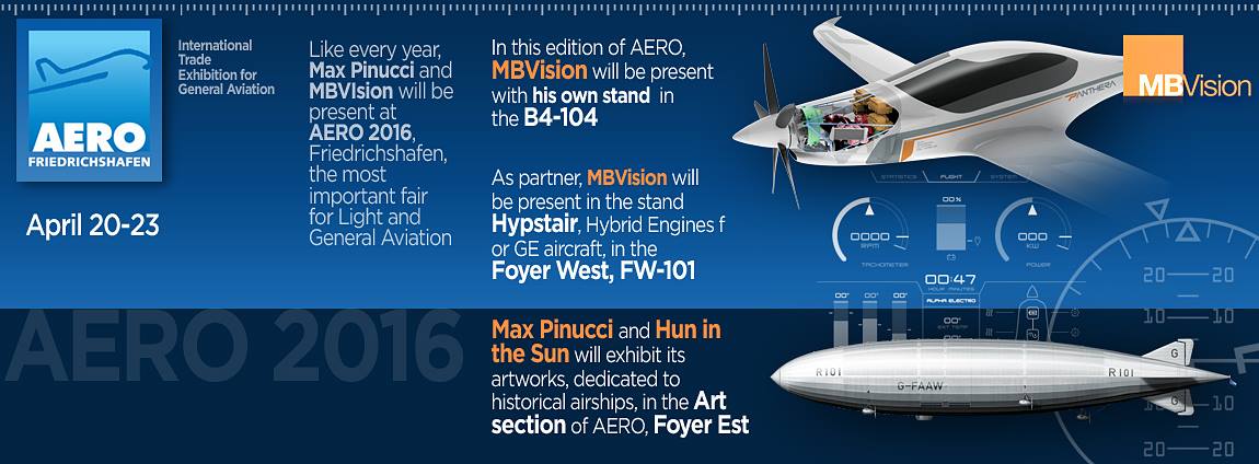
During the trade fair held in 2016, Max Pinucci gave a talk whose communication and graphics were taken care of.
OTHER WORKS FOR Pipistrel

